Image via website
Spring 2026 is not playing it safe, this season’s colour palette is split between soft, calming tones and bold, attention-grabbing shades, and honestly, there’s no in-between. It reflects the mood of the moment, where there is a clear desire for calm, balanced by an equally strong need for energy and self-expression. Rather than choosing between soft and bold tones, designers are embracing both. The result is a season defined by contrast, where colours are either understated and natural or vibrant and confident, with very little in between.
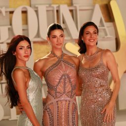
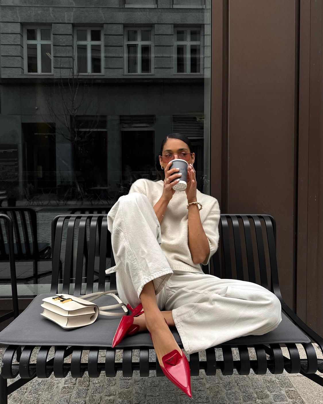
Cloud White
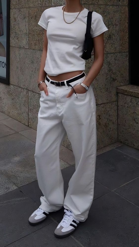
Image via website
Cloud white stands out as one of the defining shades of the season. Softer than a crisp white, it carries a sense of ease and understated elegance. Designers are using it as a foundation across collections, creating looks that feel clean, modern, and refined. It aligns closely with the ongoing quiet luxury movement, where the focus is on simplicity, quality fabrics, and precise tailoring rather than logos or excess detail.
Tomato Red
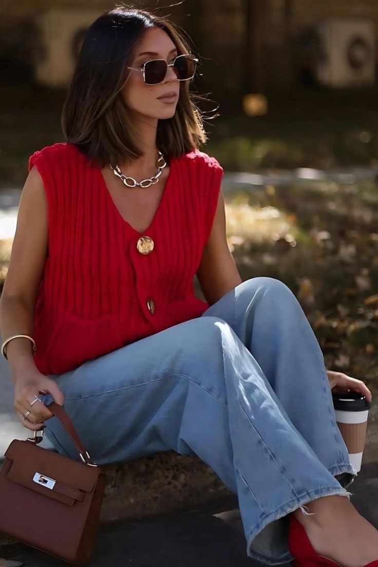
Image via website
Tomato red emerges as one of the most striking colours this spring. Bold, energetic, and impossible to ignore, it appears in everything from dresses to tailoring and statement accessories. The message behind it is clear: visibility and confidence. It is a colour chosen to stand out rather than blend in.
Cobalt Blue
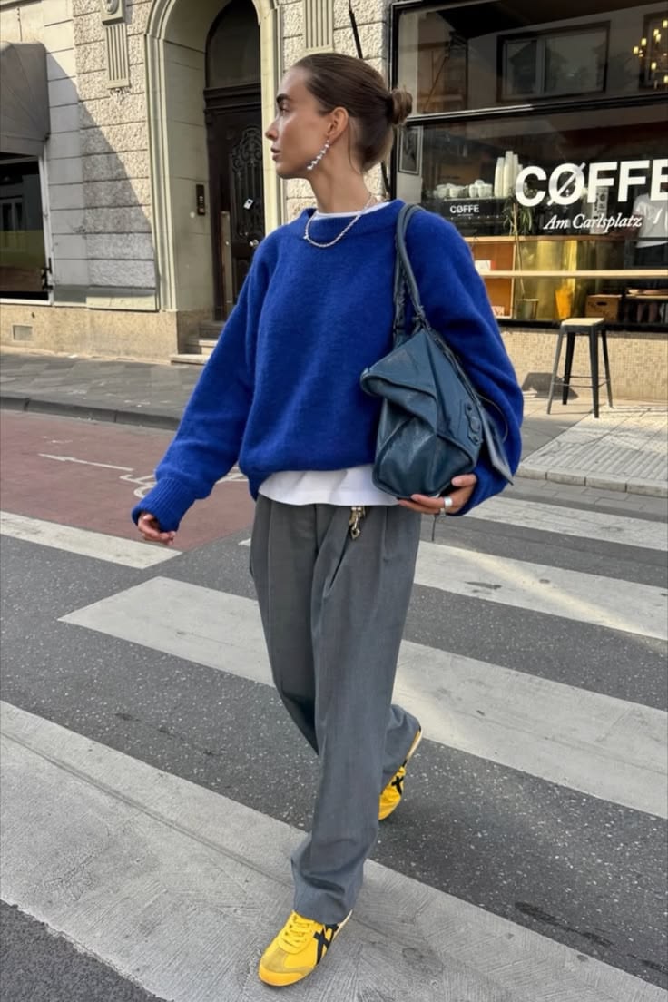
Image via website
Cobalt blue is everywhere this season, particularly in suiting, shirts, and eveningwear. While strong, it carries a refined elegance that makes it more versatile than brighter tones. Designers favour it for its ability to transition effortlessly from day to night, pairing seamlessly with neutrals like white and beige, as well as more vivid shades.
Butter Yellow
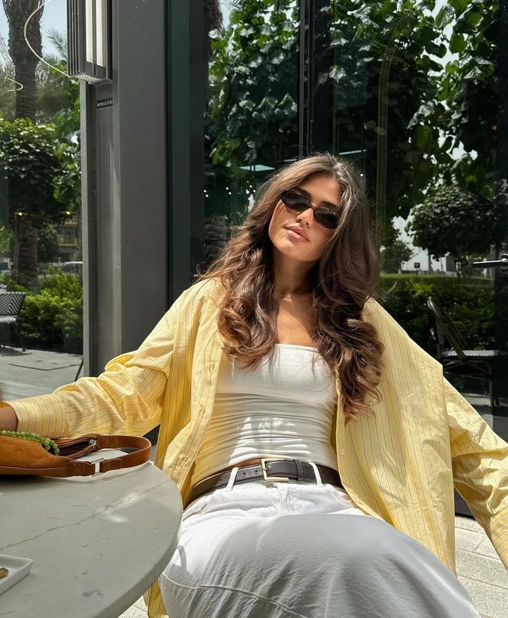
Image via website
Butter yellow introduces a softer, more optimistic tone into the palette. Gradually replacing beige, it brings warmth and subtle brightness without overwhelming the look. It is especially prominent in dresses, light outerwear, and everyday pieces, reflecting a broader shift towards gentle, uplifting colours. You can even match it with a cloud white base.
Sage Green
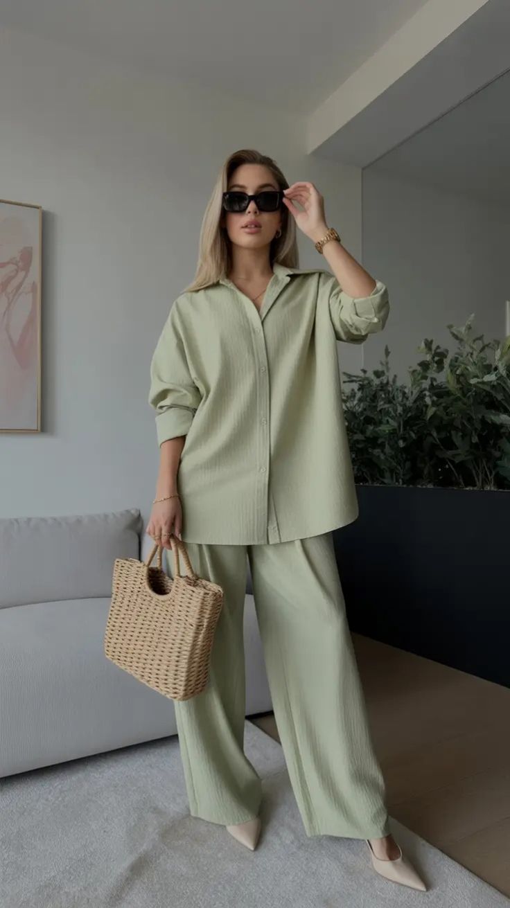
Image via website
Sage green continues its presence as a staple shade, valued for its connection to nature and sense of calm. Frequently seen in linen, casual wear, and relaxed silhouettes, it offers a quiet sophistication. Its versatility allows it to pair effortlessly with white, earthy tones, and soft pastels.
Lilac
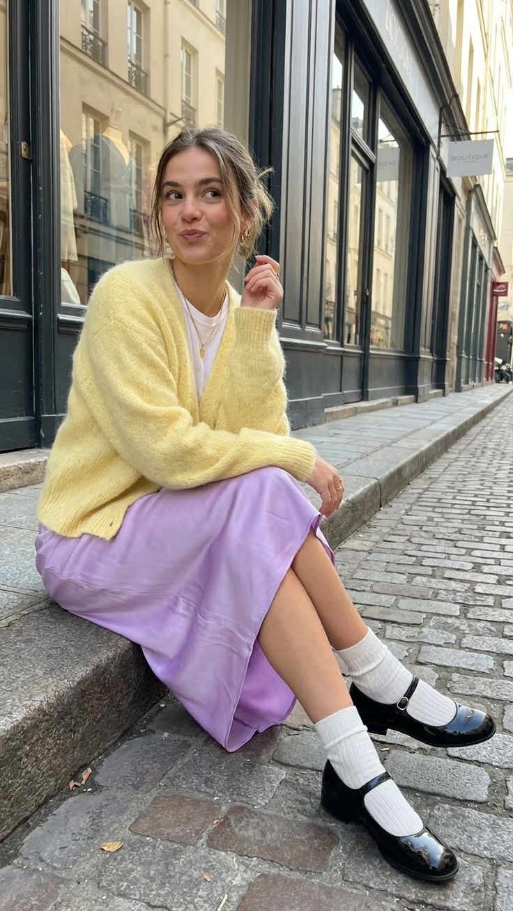
Image via website
Lilac adds a romantic, airy dimension to the season. Used across flowing fabrics, dresses, and blouses, it delivers softness without feeling overly delicate. As part of the evolving pastel trend, lilac in 2026 appears more refined and mature, moving away from overly playful interpretations. And if you are bold enough, you can match it with a butter yellow piece.
Tangerine Orange
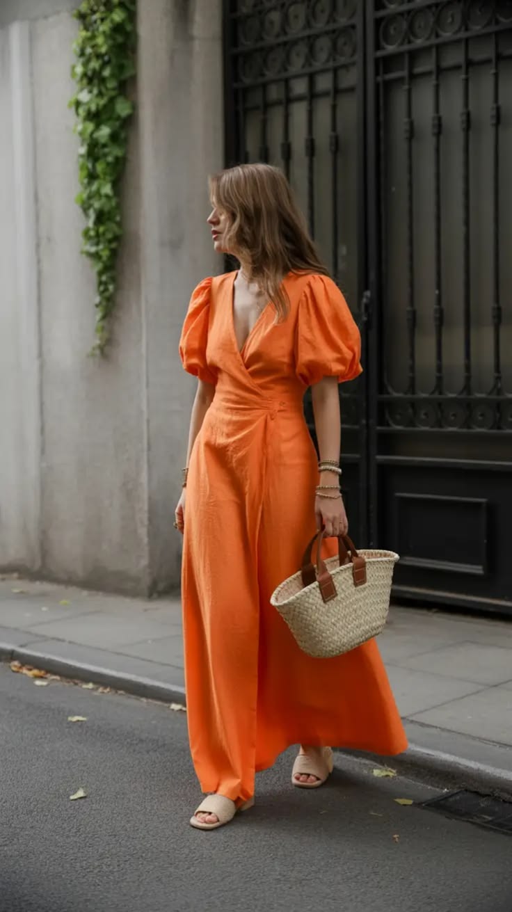
Image via website
Tangerine orange brings a vibrant, playful energy to the mix. Often seen in accessories, summer pieces, and athleisure, it injects life into otherwise simple outfits. When paired with neutrals or cooler tones, it creates a striking yet balanced contrast.
Olive Green
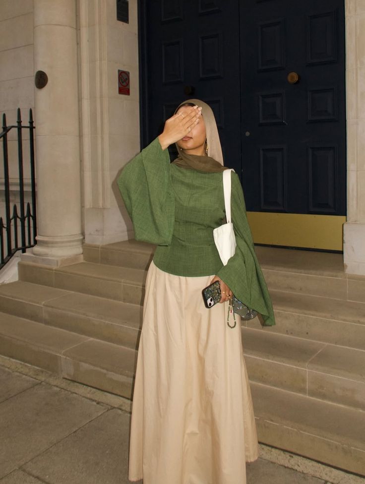
Image via website
Olive green continues to establish itself as a modern neutral. Moving beyond traditional shades like black, grey, and beige, it offers a grounded alternative that works across a range of styles. It is particularly prominent in outerwear, trousers, and accessories.
Chocolate Brown
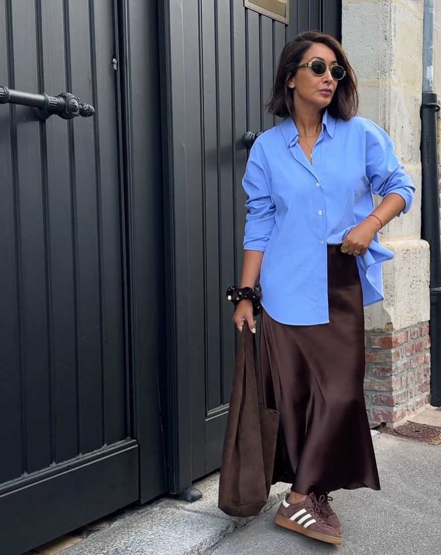
Image via website
Chocolate brown emerges as another key neutral, offering a softer, warmer alternative to black. It appears across leather pieces, footwear, and lightweight outerwear, adding depth and richness to spring looks without feeling heavy. And if you want to spice things up, maybe match it with one of the cobalt blue shades.
Spring 2026 tells a story of balance. On one side are calming tones that evoke comfort and ease; on the other, bold colours that encourage confidence and individuality. Rather than following a single direction, the season invites personal interpretation, whether that means leaning into softness or embracing statement shades. Ultimately, it is about choosing colours that reflect how you want to feel.