Since the design of the first Pharaohs’ plane to Russia, we have seen people comment on the “poor design.” Then it was national football team bus, then it was the plane again (after they redesigned it), and then it was the bus again (after they redesigned that too). Regardless, it was too late for another edit, but we have noticed that there is this ongoing trend of online criticism towards designs affiliated with “big” projects. The latest of them is the Grand Egyptian Museum’s logo. Here is how it looks…

Here is how some people reacted...

"Bla bla… the world’s biggest museum deserves more thought into something like as its logo… bla bla… it could have been much better, you could have done it better… bla bla…"

“Feels like the logo was designed in haste. Shouldn’t the typeface be more glorious and representative of the Egyptian history and the grand museum?”
However, in the end, something beautiful happened. Some of Egypt’s best designers created illustrious and meaningful designs.


“The design is a mixture between the ancient Egyptian winged sun disk and the scarab beetle, symbolising power and renewal respectively,” Alya added, “The horizontal geometry intends to portray the stability and status of the museum.”


Her designs are meant to communicate how each hieroglyph is interpreted either visually, or through the culmination of understanding history. She even went to extreme lengths to rebrand each part of the Grand Egyptian Museum.
3) Hossam Saad

Hossam went through the trouble of creating an attractive poster for the museum’s opening.

Arkan is very meticulous about blending modern design with ancient sculpting techniques.
5) Alaa Darwish


Alaa looks like a forward thinking man, one who is capable of understanding what it means to wobble through 100,000 artifacts over 700,000 square feet. With that in mind, it seemed that he was left with the option of designing an application that will help guide visitors.
6) Gilan Atris


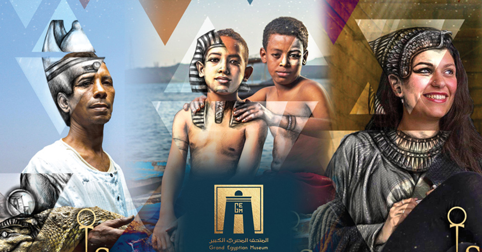
Gilan’s aesthetics rebranded the Grand Egyptian museum in a way that makes it more appealing to every generation. It is chique and clean. She also created several posters to advertise the GEM, and they literally “see through the eyes of history!”

Last but not least, another aesthetically beautiful logo!
_____________________________________
Special Thanks to Nadine Haroon!
Cover stills by Abdel Rahman Gabr-koree
Article By Adel M. Fakhry